Grid Layout in CSS: Interface Layout for the Web
Eric A. Meyer
| Publisher | O'Reilly Media |
|---|---|
| Published | 2016-04-14 |
| ISBN | 9781491930212 |
| Format | Ebook |
| Print pages | 84 |
| Genre | Computer Science |
For many years web developers have used various substitutes for a real grid layout in CSS. Floats, clears or tables provided ways to emulate it, but they were never meant to be used for this purpose. Even grid systems like 960.gs or Skeleton were just workarounds for a lack of real solutions. We were waiting for a dedicated grid layout in CSS for 20 years. The wait is now over.
Who is this book for?
This book is for front-end developers and web designers who want to use new techniques and already know the basics of CSS. You should know how to use absolute and relative units, classes, how to align elements and have some general experience with CSS.
What can you learn?
Normally I would list all chapters and add a short summary for each here. Strangely enough, this book consists of only one chapter called “Grid Layout”.
After a short investigation, it turned out that this book is just a part of bigger one called “CSS: The Definitive Guide, 4th Edition”. You can find it as chapter 13 there. For some reason, it was published as it is, without promoting subchapters to chapters.
So, this time I won’t write about all the (sub) chapters, as this would change this review into a long tutorial. But before you will jump into this book to learn what grid-template-columns: repeat(4, 10px [col-start] 250px [col-end]) 10px; means, I would like to show you probably the easiest way of using grids. You can “paint” your layout in a definition of a container:
#container {
  display: grid;
  grid-template-areas:
  "header header  header"
  "left   content right"
  "left   footer  footer";
}
Grid cells with the same name will be treated as one area. You can use any names, the ones that I used are not any special keywords and even single letters will do. Then just assign your elements to these areas:
#header  { grid-area: header; }
#sidebar { grid-area: left; }
#navbar  { grid-area: right; }
#main    { grid-area: content; }
#footer  { grid-area: footer; }
And that’s it. No floats, clears, table cells or other hacks. For a markup like this:
<div id="container">
  <div id="header">Header</div>
  <div id="main">Main content</div>
  <div id="sidebar">Sidebar</div>
  <div id="navbar">Navigation bar</div>
  <div id="footer">Footer</div>
</div>
you will get something like this:
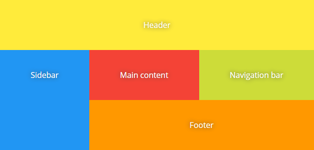
Compare this to the “ASCII art” in #container definition. Pretty cool, isn’t it? I omitted additional styles for font-family, background-color and padding in above CSS rules for clarity.
You probably would like to set a custom size of rows and columns, make them fixed or flexible. Maybe you want some gutters between the cells. This book covers all of this.
Final thoughts
As all major browsers currently support Grid Layouts, it’s time to move on. Indeed, this new concept may require that you change the way of thinking about positioning elements on the page. You may need to get rid of included grid systems, clean your stylesheets from unnecessary floats, or maybe write a new base from the ground up. But after that, your CSS styles will become much simpler.
Eric A. Meyer provided a really clear explanation of everything that you have to know about using grid layouts in CSS. Starting from creating a grid container, through attaching elements to the grid, and ending with advanced cases of layering and ordering. Each topic is illustrated with an example code. What’s also important, the book contains many figures that are really helpful in understanding the concepts.
I can recommend “Grid Layout in CSS” to everyone interested in switching to the real thing. This book is short but contains everything it should do; I could not find anything to complain about. The only “problem” to consider might be whether you need just this book (chapter) or want to learn or refresh other topics included in “CSS: The Definitive Guide, 4th Edition”.


Comments